

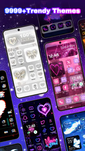
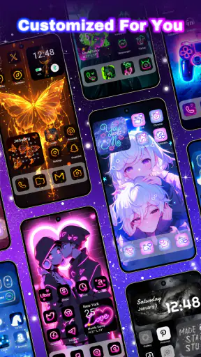
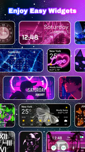
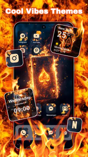
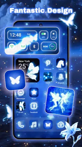
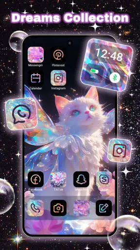
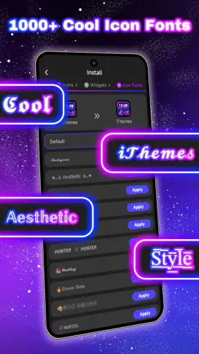
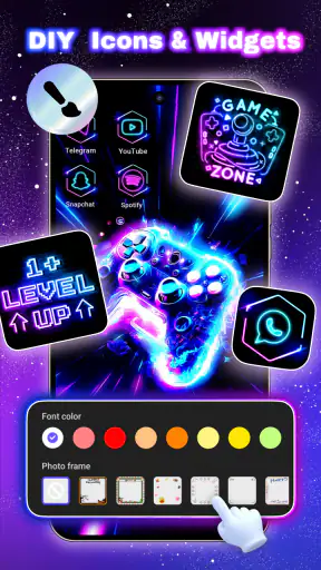
I spent time with iThemes - Easy Widgets, Icons as a personalization app, and my first impression was that it is aimed at people who want to change the overall mood of an Android phone rather than adjust one isolated wallpaper. It brings themes, icons, widgets, and wallpapers into one place, which makes the setup process feel more like choosing a complete visual direction than collecting separate downloads.
That approach is useful when the default home screen has started to feel dull, or when different icon packs and wallpapers no longer look as though they belong together. I could browse with a specific style in mind, but I also found it more enjoyable to begin with a general feeling—clean, colorful, dark, playful, or minimal—and see where the available combinations led. The app is free to install, so trying that process does not require an upfront payment.
How the app works as a complete customization tool
The main appeal is the way several personalization elements sit in the same experience. Instead of searching separately for a background, an icon pack, and a widget style, I can treat them as parts of one home-screen makeover. That is especially convenient for anyone who wants a result that looks coordinated without spending an evening comparing unrelated apps.
The developer, Wallpaper World Designs, positions the app around a large collection of themes, icons, widgets, and wallpapers. The catalog is described as containing more than ten thousand creative options, which suggests plenty of room for browsing. In practical terms, that breadth is both a strength and a challenge: I get variety, but I also need a little patience before deciding what actually suits my phone.
I would not describe this as a tool for designing every visual detail from scratch. Its strength is selection and combination. If you want ready-made inspiration and a faster route to a noticeably different home screen, it makes sense. If you want to draw your own icons, tune every color value, or build a highly personal layout from individual components, a more specialized launcher or design tool may be a better fit.
What the free starting point really means
The app is free, and that matters because I can explore its personalization approach before deciding whether it deserves a place on my phone. There are in-app purchases ranging from $0.99 to $39.99 per item, so the free entry point should not be confused with every part of the catalog being included without charge. I would begin by testing the free choices and only consider paying if a particular style solves a real problem for me.
That distinction is important for a customization app. A wallpaper is easy to replace, while a full visual setup can take time to arrange and get used to. I would not pay simply because a theme looks attractive in a preview. I would first check whether the icons remain readable, whether the widget fits my routine, and whether the style works with the apps I use most. The free access gives me a sensible way to make that judgement.
For someone who changes their phone appearance often, individual purchases can become harder to justify because the novelty may wear off quickly. On the other hand, a person who finds one consistent theme they genuinely enjoy may see a paid item as worthwhile. The value depends less on the number of available designs than on whether one of them improves daily use.
Where the catalog delivers practical value
The strongest benefit is convenience. A coordinated set can remove the small decisions that usually slow down customization. I do not have to wonder whether a random icon pack will clash with a separate wallpaper, or whether a widget from another source will make the home screen feel crowded. Starting from a theme gives me a visual reference point.
There is also value in using the app as an idea generator. Even when I do not apply a complete theme, browsing combinations can help me decide what I want from my phone. I might discover that a calmer background makes text easier to read, or that a simpler icon treatment makes a busy app grid feel less distracting. That kind of visual reset is more useful than changing the wallpaper repeatedly without considering the rest of the layout.
One workflow I found sensible is to change only one part at a time. I would first choose a wallpaper, then check whether the icon style still has enough contrast, and only then add a widget. This prevents the common problem of applying a complete look that seems attractive in a preview but becomes visually noisy on the actual home screen. The app’s combined catalog makes this comparison easier because the pieces are presented within the same personalization context.
Another useful approach is to create a theme around a daily purpose. For example, I could use a restrained style on the main screen where I keep calendar, weather, and communication tools, while reserving a more expressive look for a secondary page. This is a better use of the collection than treating every screen as a showcase. The goal is not just to make the phone different; it is to make the layout easier to live with.
Widgets are useful only when they earn their space
Widgets can make a home screen feel finished, but they also take up valuable room. My advice is to choose one because it gives me information or access I actually use, not because it completes a preview image. A decorative widget may look good at first and then become visual clutter after a few days.
Before committing to a theme, I would check how much space its widget style appears to need and whether that leaves room for the apps I reach most often. A beautiful arrangement that forces important shortcuts onto another page is not automatically an improvement. This is one of the trade-offs of a design-led app: the most attractive composition is not always the most efficient one.
I would also pay attention to legibility in different conditions. A pale widget on a bright wallpaper can be difficult to scan, while a heavily decorated icon set may make familiar apps slower to identify. The best result is usually the combination that looks distinctive while preserving quick recognition. That balance is something I need to judge on my own device rather than relying only on a preview.
Icons and the limits of a polished appearance
Icons have a bigger effect than many people expect because they are the part of the home screen I look at repeatedly. A consistent icon style can make an older phone feel refreshed, but it can also introduce friction if some frequently used apps do not match the chosen design. I would therefore test the first page of my home screen before applying a style everywhere.
A practical trick is to keep the most-used apps in a position where their shapes remain easy to recognize. If a theme makes every icon look too similar, I may gain visual consistency but lose speed. For me, that is a meaningful trade-off. Personalization should support muscle memory, not force me to pause and read labels for basic tasks.
This is also where the app may be less suitable for users who already have a carefully organized launcher setup. If my current arrangement depends on precise icon behavior, custom shortcuts, or a very specific grid, a theme-focused app may not replace those tools. It can still provide visual material, but I should not expect it to become a full substitute for every launcher feature.
What I would check before paying
Because the app combines free access with optional purchases, I would use a simple test before spending anything. First, I would apply or preview a free style and live with it through normal tasks. Then I would ask whether the paid option offers something materially better for my routine: clearer widgets, a more coherent icon treatment, or a look I am likely to keep for a long time.
I would also avoid buying several items while browsing impulsively. The large collection encourages exploration, and attractive previews can make every option seem useful. A better method is to save a short list of candidates mentally or through the app’s available browsing flow, compare them against the same home-screen layout, and choose one direction. That reduces the risk of paying for designs that overlap in practice.
The upper end of the stated purchase range is significant enough that I would expect a strong personal reason before considering it. I can recommend the free starting point confidently, but paid value is more individual. Someone who changes themes once a year may not need to spend much, while a dedicated customization fan may find more reason to invest. I would judge the purchase by how long the result remains useful, not by how impressive the preview looks for a few minutes.
Everyday use: a realistic home-screen refresh
Imagine coming home after a long day and realizing that the phone feels visually chaotic: a bright wallpaper, mismatched icons, and a widget that no longer provides useful information. With this app, I would start by choosing a calmer background, then look for icons that keep the same general tone. I would add only a single practical widget, perhaps on the page where I already check information, and leave the rest of the layout familiar.
That scenario shows where the app is most helpful. I do not need to rebuild the phone from zero, and I do not need to install separate sources for every component. I can make a focused change in one session, then adjust the arrangement after using it normally. The result is more likely to last because it improves the parts that were bothering me instead of adding decoration everywhere.
A different user might want a seasonal or event-based makeover. In that case, the broad catalog is useful for finding a temporary style, but the free-versus-paid distinction becomes more important. I would avoid purchasing an expensive item for a look I expect to remove soon. Free options are better suited to experimentation, while a paid choice makes more sense when it fits my everyday identity and remains comfortable over time.
Compatibility and setup expectations
The app supports Android devices running version 7.0 or later, which gives it a broad potential audience among Android users. That does not mean every phone will present themes, icons, and widgets in exactly the same way. Home-screen behavior can vary with the device maker and launcher, so I would expect to do some manual arranging after selecting a style.
This is an important expectation to set before installing. The app can provide the visual ingredients, but the final result still depends on the phone’s home-screen environment. If I want a completely automatic transformation with no adjustment, I may find the process less seamless than expected. If I am comfortable making small layout changes, the flexibility is more useful.
I would also keep the current version in mind when troubleshooting. The listed version is 1.0.0.3419, and that gives me a clear reference point if I need to check whether my experience matches the current release. I would not treat a theme preview as a guarantee that every element will behave identically across all Android interfaces; the phone itself remains part of the setup.
Who will get the most from it
I think this app is a good match for Android users who enjoy changing their home screen but do not want to assemble a complete design system themselves. It is also useful for someone moving to a new phone and wanting a quick visual identity, or for a user who has collected separate wallpapers and icons but wants a more unified direction.
It may appeal particularly to people who like browsing. The collection is large enough to support discovery, and the free access lowers the risk of trying a style that turns out not to suit me. It can also help a less experienced user understand how wallpaper, icons, and widgets influence one another. I do not need advanced design knowledge to begin making meaningful changes.
I would be more cautious if I were very sensitive to clutter, strongly attached to my current launcher, or unwilling to spend time adjusting the final layout. The app is not the ideal choice for someone seeking deep technical control over every home-screen behavior. In that situation, a dedicated launcher with granular layout settings may be the better primary tool, while this app could serve only as a source of visual inspiration.
How it compares with separate apps and launchers
The usual alternative is to install one app for wallpapers, another for icons, and perhaps a launcher for widgets and layout control. That route can offer more specialization, but it also creates more decisions and more chances for the pieces to clash. iThemes is more convenient because it keeps the creative search centered on a single personalization experience.
Separate apps may still win when I care about one category above everything else. A dedicated wallpaper service can be preferable if backgrounds are my only priority, while a powerful launcher is better when gestures, grids, folders, and app behavior matter more than appearance. This app’s advantage is balance: it makes a coordinated makeover easier, but it does not necessarily provide the deepest control in each individual area.
There is a second trade-off involving attention. A single large catalog is easier than visiting several sources, yet it can also encourage endless browsing. I would set a clear goal before opening it—refresh the lock screen, simplify the first page, or find a matching icon style—so the choice serves a purpose instead of turning into an unplanned search through designs.
My verdict on value and whether to install
The app’s overall value comes from lowering the effort required to create a coordinated Android home screen. It is free to start, offers a broad selection of visual components, and gives me a practical way to experiment before considering optional purchases. Its strongest use is not extreme customization; it is making a phone feel more personal without forcing me to become a designer.
The limitations are just as clear. A large catalog can make selection tiring, paid items require careful judgement, and the final appearance may still need manual adjustment depending on the phone’s home-screen setup. Widgets and icons can also sacrifice convenience if I choose them only for appearance. Those are manageable issues, but they mean I should evaluate the result through everyday use rather than a quick preview.
With a 4.8 average from around 74 thousand ratings and over 5 million installs, the app has attracted a substantial Android audience. Its content rating is Everyone, and it was released on October 22, 2021. Those details give me useful context, but my recommendation rests mainly on how well its free starting point fits a particular customization habit.
I would install it if I wanted an easy, coordinated visual refresh and was willing to make a few layout decisions myself. I would skip it as my main solution if I needed advanced launcher control or only wanted a single wallpaper source. For everyone in between, the sensible path is to begin free, test one complete look during normal phone use, and pay only when a specific design proves that it improves the experience rather than merely decorating it.


